Themes and Styles
Introduction
Themes and styles can be used to control the configuration, behavior and apperance of views in your scene. A theme is a XUML file containing a collection of styles that defines the default values a view should have. If you're familiar with HTML, a theme can be seen as the CSS file and its content (selectors) would be equivalent to the styles.Using Themes
If you want to use an existing theme you can set the default theme on the view presenter: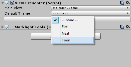
This theme will be applied to all views in the scene. The standard theme files resides at Assets\MarkLight\Views\Themes.
Creating a New Theme
A theme is a XUML file that has the root element Theme:MyCustomTheme.xml
<Theme Name="MyCustomTheme">
</Theme>
The theme file can be put in any of the views-folders (defined in the configuration asset). The theme element has a few attributes that you can set. The Name attribute is required.
| Attribute | Description |
|---|---|
| Name | The name of the theme. Seen in the drop-down list on the view presenter and used when specifying theme on view level. |
| BaseDirectory | Base directory for the assets (sprites, fonts, etc) referenced within the theme file. E.g. if BaseDirectory is set to "Assets/MarkLight/Themes/Flat/" a path within the theme can be specified as "Sprites/CheckBox.psd" which will be translated to "Assets/MarkLight/Themes/Flat/Sprites/CheckBox.psd". |
| UnitSize | Unit size is a user-defined element size unit that can be set and used within the theme by using the postfixes ux, uy and uz. E.g. if UnitSize is set to "40,50,20" you can specify the width of a view as "1ux" and it will be translated to 40 pixels, 1uy = 50 pixels and 1uz = 20 pixels. |
Creating Styles
Let's say you want all buttons in your scene to have another background color. You can define this by creating a new style in your theme:MyCustomTheme.xml
<Theme Name="MyCustomTheme">
    <Button BackgroundColor="Blue" />
</Theme>
You've created a universal style that will be applied to all button views. If you want your style to only be applied to certain buttons you specify this through the Id and Style attributes:
MyCustomTheme.xml
<Theme Name="MyCustomTheme">
    <Button BackgroundColor="Blue" />
    <Button Style="RedButton" BackgroundColor="Red" />
    <Button Id="MyButton1" BackgroundColor="Green" />
</Theme>
Now all buttons that has Style="RedButton" will have a red background color. The button with Id="MyButton1" will have a green background color. All other buttons will have a blue background color. Here is an example of how the styles can be used in your scene:
MainMenu.xml
<MainMenu>
    <Group Spacing="10">
        <Button Text="Button1" Width="180" Height="50" />
        <Button Style="RedButton" Text="Button2" Width="180" Height="50" />
        <Button Style="RedButton" Text="Button3" Width="180" Height="50" />
        <Button Id="MyButton1" Text="Button4" Width="180" Height="50" />
    </Group>
</Theme>
If MyCustomTheme is set on the view presenter the first button should be blue, the second and third will be red and the last will be green.
Basing Styles on Others
If you want to create a new style that is based on an existing style you can use the BasedOn attribute:
<Theme Name="MyCustomTheme">
    <Label Style="NormalText" FontSize="22" FontColor="#333" Font="MyDefaultFont.ttf" />
    <Label Style="SmallText" BasedOn="NormalText" FontSize="16" />
</Theme>
The SmallText style will inherit the values of the NormalText style.
Not Just Looks
Styles can be used to set any view field value which means it's not just about defining the visual appearance of a view. E.g. do you want lists to select items on mouse up by default? Use the theme file:
<Theme Name="MyCustomTheme">
    <Group Orientation="Horizontal" Spacing="4" />
    <List SelectOnMouseUp="True" />
</Theme>
Using Multiple Themes in a Scene
You have the option to specify the theme on a view level and have multiple themes in the same scene:MainMenu.xml
<MainMenu>
    <Group Spacing="10">
        <Button Theme="Flat" Text="Button1" />
        <Button Theme="Neat" Text="Button2" />
        <Button Theme="Toon" Text="Button3" />
    </Group>
</Theme>
In the above example the Flat theme will be applied to the first button and all its children.
Views Inhereting Style
In some advanced cases when creating custom views, you may want the style of a view to be inherited from the parent. You can implement this by setting the style to *:
<MyCustomView>
    <Label Style="*" Text="Label Text" />
</MyCustomView>
You can set the style of MyCustomView:
<AnotherView>
    <MyCustomView Style="SomeStyle" />
</AnotherView>
And the Label within MyCustomView will receive the style "SomeStyle".